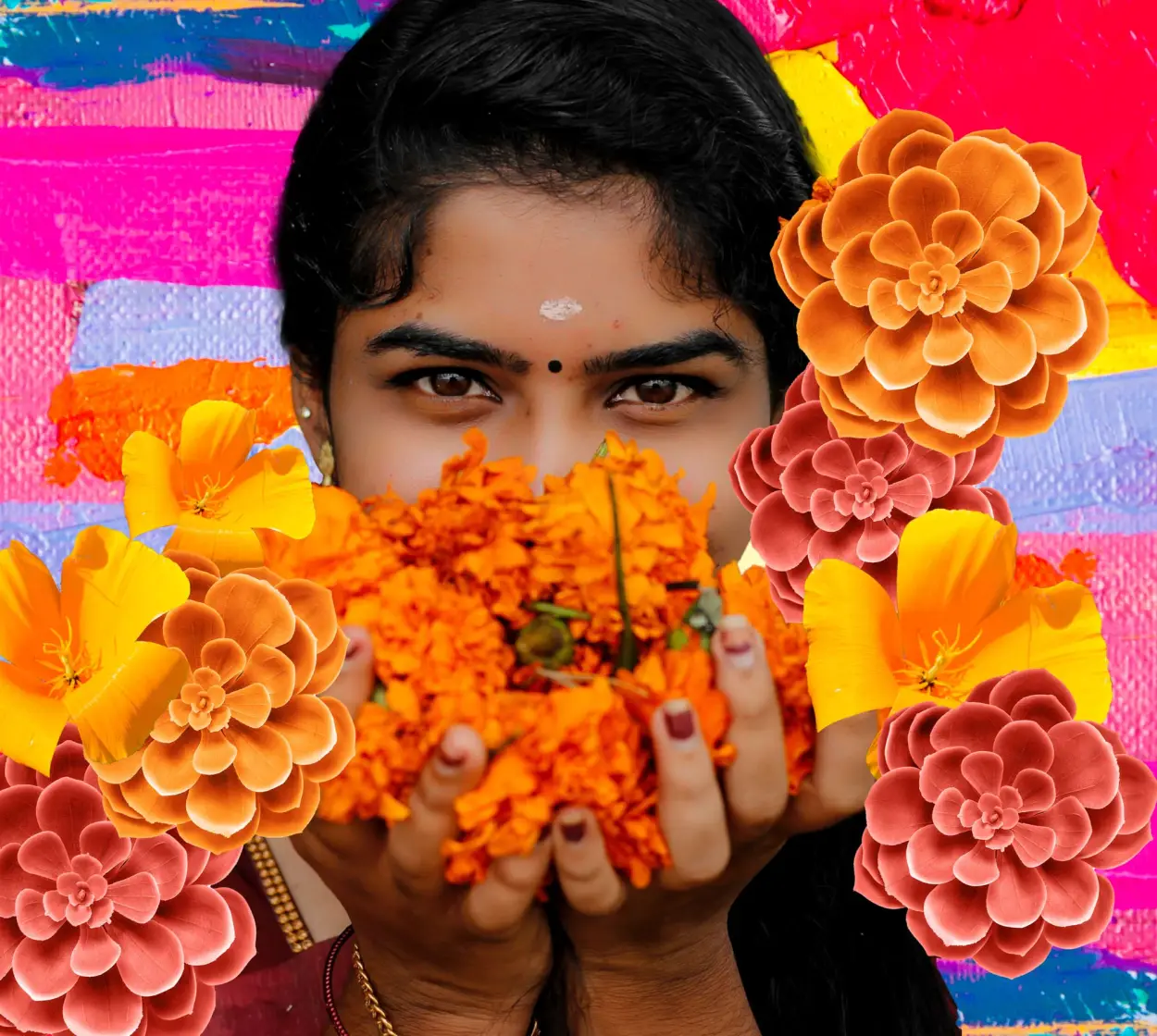
Exuberance
Exuberance is a warm, vibrant shade of orange with soft brown undertones. Orange appears directly across from blue on the color wheel, so by using them together, you can bring out the truest tones in both shades. This alluring hue looks especially contemporary when used with peacock blue, cerulean, or indigo. When incorporated in an analogous palette with other warm colors like mustard yellow, terracotta, and rust, this shade creates a warm, cozy aesthetic. Exuberance is an absolute must in interior design. Try a muted, slightly muddy version for your walls or go bold by adding a pop of this spicy orange to your tried-and-true neutrals. Try to avoid pairing it with black. Instead, pair this fruity hue with camel or khaki for a look that’s both modern and sophisticated. Orange with crisp white is an unexpected but flattering choice for spring and summer soirees.
More Information About Exuberance
The hex code for exuberance is #EB6E23. Similar hex codes include #CF5230 (untamed orange) and #C98A76 (campfire).
Exuberance is a warm yet vibrant shade of orange with soft brown undertones.
The color exuberance has a history steeped in art. It’s most readily seen in art movements such as Fauvism, where highly saturated colors were coveted and used to convey a sense of energy.
Exuberance exudes energy, liveliness, and joy. At the same time, it is often associated with a sense of calmness and serenity.
Exuberance looks especially contemporary when used with peacock blue, cerulean, or indigo. When incorporated in an analogous palette with other warm colors like mustard yellow, terracotta, and rust, this shade creates a warm, cozy aesthetic.
Similar Colors to Exuberance

Exuberance vs Burnt Orange

Exuberance vs Copper

Exuberance vs Chamois
Discover More Orange Colors
From the Blog: Top Color Resources
The Meaning of Colors in Cultures Around the World
Color quite literally colors the way we view our world. Let’s take a deep dive into the symbolism of colors in cultures around the world.
101 Color Combinations to Inspire Your Next Design + Free Swatch Download
In this roundup, we compiled 101 new color combinations to inspire your next project. Download the free swatch files today!
What Are HEX Colors and How They Work in Design
What exactly is HEX color? Learn the definition of HEX colors, how many there really are, and discover how to use them in your designs.
What Is a Color Scheme? Definitions, Types, and Examples
Learn everything you need to know about color schemes and how to apply them to your next interior design, graphic design, or web design project.

Images to boost your business
High-quality, legally protected images available at a low price.
We have more than 475,000,000 assets on Shutterstock.com as of November 30, 2023.
